I have a favor to ask of conventions: please design your badges so that names can be easily and clearly read.
I’ve never been good with names. It’s frustrating as hell, and it’s become a bigger problem as I travel to more conventions. I get introduced to so many people, and within 24 hours, a lot of those names escape my brain like Batman villains from Arkham Asylum.
Most of the time, it’s not that I forget the people — just the names. (Sorry, Darla!) Especially if it’s been a while (folks I see once a year at a given convention, for example) or the context is different. Even when my brain retains a tentative grasp on a name, I tend to not trust myself, and still try to check badges to make sure.
Compare these two badges. The one on the left is from Convergence. The one on the right I made up as an example, but it’s pretty close to some I’ve seen at various conventions.
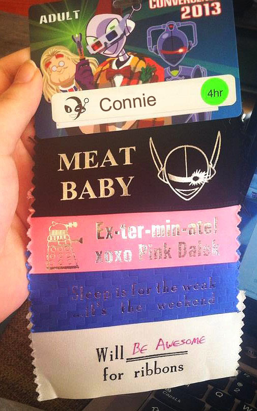

Convergence’s badge is relatively easy to read, with clear black text on white. Even my old eyes should be able to read that at a distance. Whereas the other example uses small type in a non-standard font, and is hard to distinguish from the background.
(This will also give me a better chance of spelling your name correctly if I’m signing a book!)
I know folks like cool artwork on the badges. I know a lot of people are better at remembering names than I am. But please take pity on those of us with older eyes and leaky brains.
Thank you,
Jim and the Society of People Who Suck at Remembering Names
Mirrored from Jim C. Hines.
From:
no subject
To the SMOFs reading: 30pt bold, black on white or buff.
From:
no subject
From:
no subject
And I'll throw in an extra request for sans-serif fonts and not-all-caps*, since those are typically easier for people with dyslexia to read.
* I mean, not all caps by default. There are definitely people who fill out their reg forms with their badge names in all caps, and those are fine in small numbers, but as a general thing, standard capitalization is the way to go.
From:
no subject
From:
no subject
If we're talking about rational design for badges, can I also put in a plea for a plurality of ways of attaching the badge to its holder? I mean, lanyard round the neck works for me, but I'm in my fifties and don't particularly expect trouble these days. When I was younger I always preferred pinned (with safety pin) to top in about the region of the left collarbone, to avoid the plausible deniable eye travelling down cleavage effect which lanyards can produce. And a pin and clip, because ones with just a clip are useless for most women's tops which don't normally have jacket lapels.
From:
no subject
I'm mostly face-blind these days, and have presbyopia and happy fun eye issues, and a memory as porous as a sieve. Upshot is that, in the absence of notable distinguishing features, I will often recognize someone's face by the third or fourth time I meet them at a con, but may never manage to put a name to it.
Also? Reading names on badges usually requires squinting. Which comes with additional social anxiety if, as a middle-aged male, I'm trying to jog my memory of the name of a female fan or pro I'm interacting with — because nobody ever pins a big, readable name badge on their shoulder, right?
From:
no subject
From:
no subject