Yesterday I received the final files from Leanna Crossan for the Amelia Sand and the Silver Queens cover.
Short version: I love it, and I’ve been happily tweaking away at text and layout. I’m now to the point where I can’t really see it anymore, which means it’s time to share and see what you think.
Here’s the full layout, which will be used for the paperback. (And as I upload the image, I can already see that I want to move that quote from Tobias Buckell a tiny bit higher so it will be centered between the bar code and the text block.)
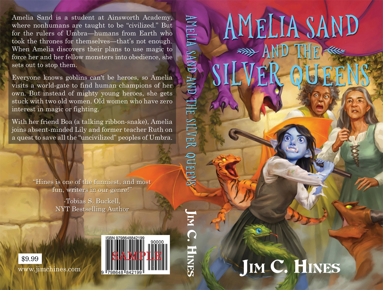
The price is not final. That’s going to depend on what the costs are. I’m not going for a huge royalty on the print copies, but I do need to be able to feed the cat and the dog. Oh, and the kids too, I suppose.
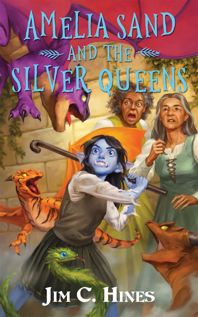
Here’s the front cover, give or take a few pixels on the dimensions, that will be used for the ebooks and online.
So… What do you think? Any suggestions before I finalize this sucker?
From:
no subject
From:
no subject
From:
no subject
My only issue is that "Queens" is hard to read against that particular part of the background except at close range. I'm not sure what color to suggest, given the varicolored quality of the art here (and you're right, that's great cover art), but if you can find a way to make the full title more readable at browsing range, I'd consider doing so.
From:
no subject
From:
no subject
From:
no subject